
Friendly
Friendly is a new form of social media that’s intended to connect people based on common interests and similarities between what people share. Users with similar interests appear in each others feeds that consist of text posts intended to start conversations and create relationships.

Friendly is a new form of social media that’s intended to connect people based on common interests and similarities between what people share. Users with similar interests appear in each others feeds that consist of text posts intended to start conversations and create relationships.
Background
One of the best things for health is friends. It’s been shown that having friends not only makes people healthier but live longer. But how do you make friends online that last? As a post-college grade, I’ve found it challenging to make lasting friends outside of my immediate network at work or elsewhere. After speaking to numerous other post-grads, I realized that this problem was not unique to me. At a time when social media is so prevalent, yet people are so lonely, I felt there must be some new way to solve this problem.

Details
Font

Color Palette

Graphics

On-boarding

Representation of diversity in design is extremely important, so I made a point to include diverse representations of users throughout the app. I believe that representation allows people to see themselves as part of the story. With this perspective, I wanted Friendly to bring together people of vastly different backgrounds while ignoring the superficiality of the judgment of friends by physical appearance. Friendly aims to reveal the similarities that we all have no matter what our background is to cause people to befriend those they may not have of chosen on an “appearance-based” app.

On-boarding is supposed to be so effortless and painless that anybody can excel at using the app.
In light of this, the design prioritizes short and easy to answer questions while leaving just a little personal space to the user so they can define what matters to them. For example, when the user gets to the “your hobbies” screen there won’t be any choices provided so that any responses aren’t tainted by predetermined suggestions. In this example, however, the user has already chosen some interests to display what that would look like.
Main Interface
Post-college me set out determined to find a way to make some new friends via apps. Along the way one of my biggest frustrations was that friend making apps all seemed to be “appearance-based” instead of being focused on learning more about the person. I wanted to find new friends who had similar interests and hobbies, instead of choosing people based on appearance. On other popular social media apps (Facebook, Twitter, Instagram) people shared their own thoughts in “posts” and a dialogue often ensues in reference to the post. I wanted to bring this dynamic to friend-making. Though, somehow I wanted to nudge users to engage in direct, genuine interaction. So, I decided to remove likes and design the app around direct messages in response to posts. Also, I wanted to remove the idea of signing up with email. It’s just unnecessary in the current day, so instead I designed it such that people simply authenticate with their other social media accounts such as Facebook, etc. The last problem I attempted to design away is catfishing, which I think Bumble does a wonderful job of addressing with the photo verification of your identity. This same sort of photo validation of identity would ideally be implemented into this app.

Home
The home screen consists of posts made my users in a similar fashion to Facebook or Twitter. The user also has the opportunity to share photos. The one response one can have to a post is to respond to the poster. When the arrow is hit to respond the two users enter a chat. By removing liking it rids of people just choosing others who are popular and encourages people to begin new conversations.
At the top the user can sort by either most similarities or closest to me. With the options on each post the user can rule people out that they don’t view as a good potential good friend.

Profile
On the home page profile pictures are not shown with the posts. The purpose is to take the emphasis off appearance when making friends. When one goes to an individual profile or their own then a photo can be seen of the user.
As there are no “followers” when making friends the app shows other helpful metrics being their age, location, number of posts, and their interests. By easily seeing what a users interests are it can be a quicker way of identifying people who are truly interested in several similar hobbies. The aim is to find genuine friendships and waste as little time as possible.
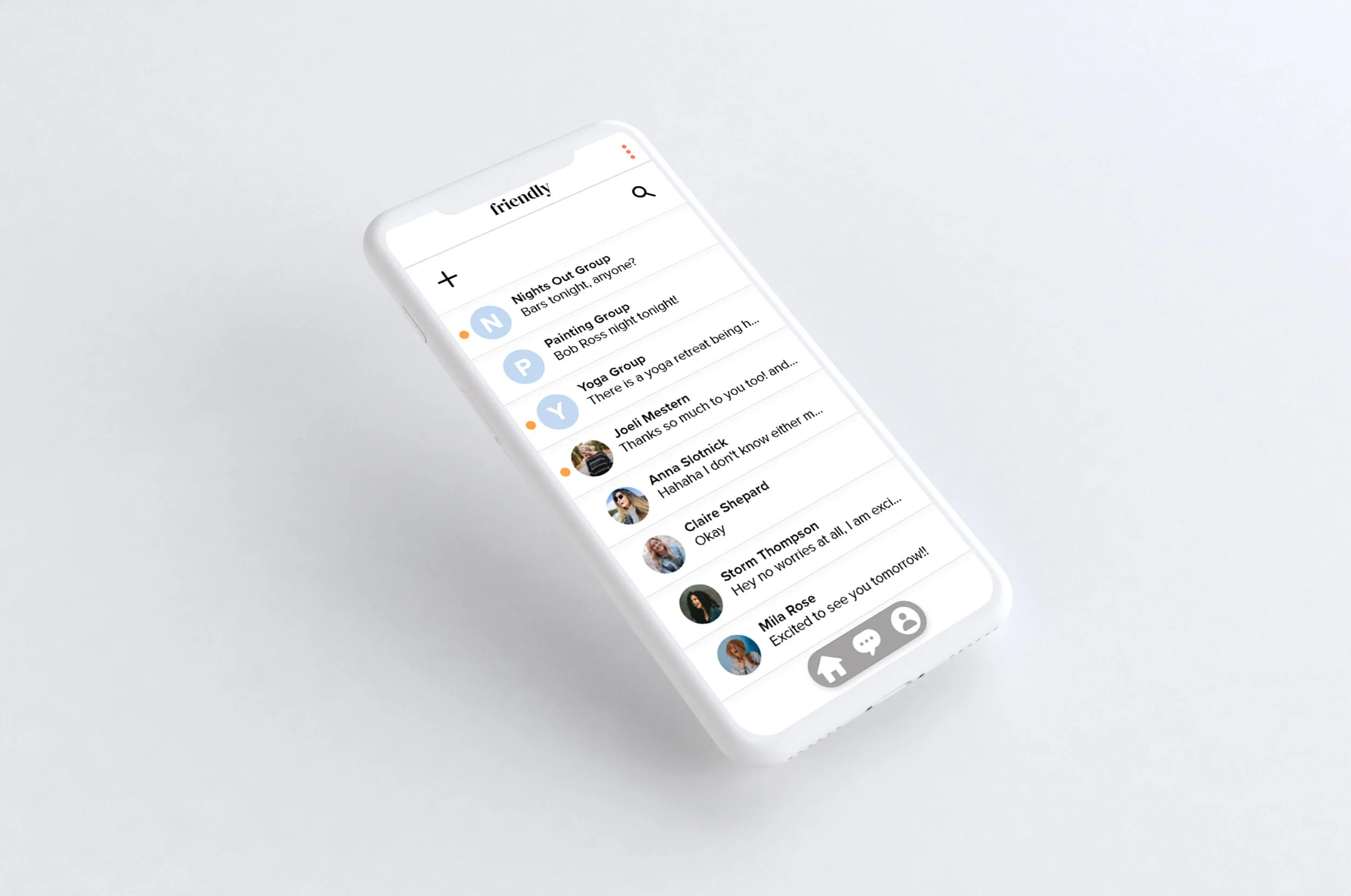
Messaging
On messaging there is both group and individual messaging.
Users can join larger groups of similar interests and message all of those people directly or they can just have their individual conversations from responding to people. As messaging can often get complicated there is a search at the top. The app automatically puts group messages at the top of the screen then followed by the newest individual message and then the rest of the messages. On group messages the icon is the first letter of the group name while individuals are their profile photos.
Menu
Events: As a brand, Friendly would sponsor events for multiple people to come to and meet up.
Coupons: This is the monetization strategy. Advertisers would pay to have their coupon posted. When friends connect and want to go do something they can get a coupon for a similar interest.
Account: This handles basic account information; username, password, and setting changes.
Privacy: Privacy addresses location services and safety for reporting.

